Articles
Comic book Design for Animation
 October 20, 2002
A question that comes up often from comic book fans is why are characters' designs modified for cartoon series? This article discusses the processes that may influence changes in character designs from comic books to animated features. The the Flash, from Cartoon Networks and DC Comic's Justice League will be used as an example.
Fans refer to the character styling used in recent series featuring DC Comics's characters such as Batman Animated, and Justice League as the "Animated look." The Animated design streamline the body shapes and the costumes of characters. Even the Flash, whose uniform is very simple, can be simplified.
Animators rely on a few body types in the Justice League, such as the generic female body and the muscular male body. The Flash's body is based on the muscular male body with slight modifications. Having a few body types helps animator animate most characters consistently. Characters without generic body types, such as the Scarecrow, the Batman villain, often have more complex motion.
Most of the changes to the Flash concern his costume. Every line on the Flash is aero dynamic. Notice that the eyes, the bolts on his arms, his ear plugs and belt all point in the centre. Even the shape of The Flash's head is aerodynamic! It is drawn as an oval.
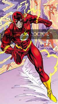 There are many design differences between the Justice League's cartoon Flash and his comic book counterpart. The ear plugs in the cartoon Flash mimic lightening bolts. In the comic book, they are wings. In the cartoon, the lightening bolts' theme reinforces the idea behind the name "The Flash."
The chest logo has major changes. In the cartoon, the Flash's bolt consists of two joined triangles flipped at 180 degrees. The comic book's bolt has three triangles. Two of them are parallel. The other one, on top, is inverted. The streamlined bolt is easier to draw than the more complex comic book version.
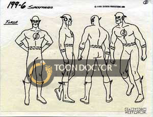
Alex Toth's design (available on page 3) for the Super Friends cartoon used the triple triangle design found in the comic book. This design puts much detail in a very small area of the character's chest. When the character is drawn very small, the lines from the triple triangle design add too many lines. The problem is worst with colors.
A drastic change from the comic book's Flash is the yellow ring around the white circle on the Flash's chest. Why did the character designer on the cartoon add a ring to the Flash's logo?
One possible reason is to stop the red on the Flash's costume to mix with other colors on television. Without the yellow ring to hold the white circle, the red on the Flash's costume could bleed on the circle. It would be like a blurred fuzzy smudge on the white ring. The yellow within the ring doesn't stop the red from bleeding. The double black lines detailing the ring do that.
 Except the bolts on his belt, two triangles construct the bolts on the cartoon Flash. Although there are four triangles in the belt, they are drawn in opposing directions. In the comic book, the number of triangles depends on the artist. Most lines forming them are parallel. They resemble zigzags instead of lightning.
Most of the designs of the cartoon Flash are shortcuts that improve save animators many efforts. They also make the Flash more dynamic on television.
Toon Doctor Inc.
Copyright ® 2002. Use of material in this document®including reproduction, modification, distribution, electronic transmission or republication®without prior written permission is strictly prohibited.
|
